

Power BI from Microsoft is a versatile, intuitive, and therefore widely used data visualization tool. But other software manufacturers are also making a name for themselves in the data evaluation market. One of them is Tableau. As an experienced Power BI developer, I was recently able to try my luck with Tableau for a customer. I would like to share the results with you in the following blog post.
To already reveal the conclusion: Both tools are ultimately very similar. I find Power BI more logical and intuitive in terms of structure. This is especially true considering the entire development process, i.e. from configuration of the data model to visualization and publication. I was fascinated by Tableau's technique for independent design of visuals. Although this is complex at first, it offers an extraordinary number of design options which cannot be implemented in this form with Power BI.
Tables, joins, and data sources
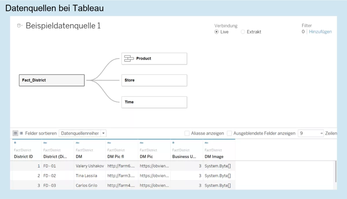
In Tableau, data are generated in data sources. In simple cases, a single data source is sufficient because multiple tables can be combined within that data source. Both tools are very similar in this respect. Also available as of August 2020 is a visually appealing semantic layer, which is helpful during creation of data models. Also nice is the preview of a virtual flat table which Tableau provides below the model view. This allows you to easily identify errors and check logic.
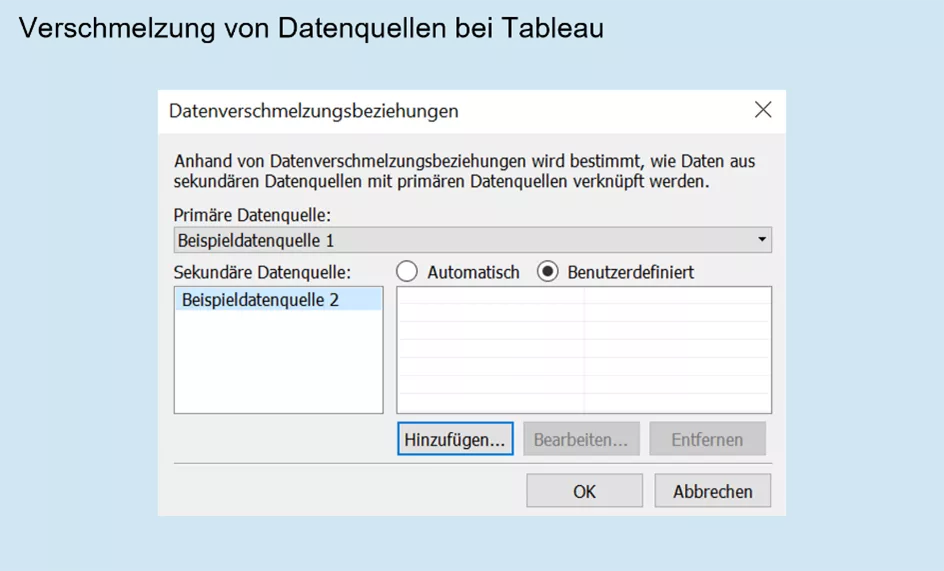
If you create two or more data sources, they can be merged with each other (if suitable). Amazingly, not even the granularity in the two fact tables has to match. Incidentally, this is extremely useful in improving the performance of very large fact tables. For example, you can create an aggregation fact table (connected via extraction), and merge it with a detail fact table (via live connection) – the counterpart to the composite model in Power BI, so to speak.
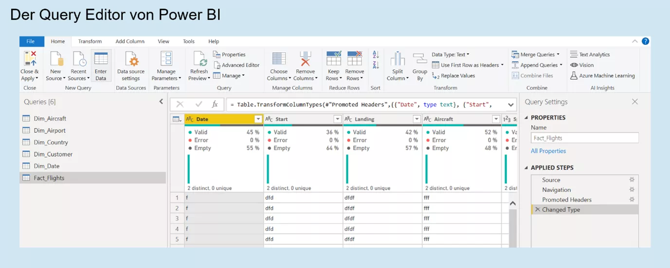
When comparing user interfaces for creating data models, I think the Power Query editor of Power BI has the edge. Firstly, it is intuitively structured and therefore suitable for beginners. Secondly, complex issues can also be covered using the query language M. Tableau here offers an extension requiring a fee but not included in the standard version.
Filter upon filter
Data filters are an elementary part of any visualization. What should ultimately lead to visualizations of exactly the right data by users is actually a source of countless errors during development. Tableau, in particular, offers 42 ways to set a filter. For example, any data source and visual can be filtered, and context filters can be set. There is also an option to furnish the dashboard with a normal filter which limits the data of multiple visuals according to requirements.
A comparison with Power BI in this respect reveals at least as many filter options: Query filters in the query editor, filters on entire reports or pages thereof, visual-specific filters and filters on report pages for end users. In both cases, any conceivable filter scenario can be implemented. However, the software structure in Power BI makes it a little easier to understand the relationships between these filters.

Independent creation of visuals, finally
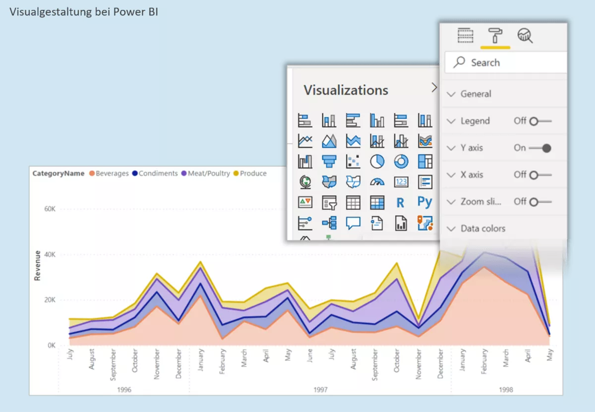
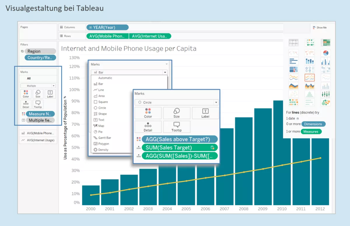
As a Power BI developer, I had become accustomed to choosing from a range of visuals to which I only had to add data subsequently. All the more amazing was my first impression of Tableau. There are no pre-defined visuals here. Instead, each visualization is configured on a separate worksheet and then merged on a dashboard (corresponding to a report page in Power BI).
In principle, data can be assigned to rows and columns in a visual. However, it is also possible (and this is the real highlight) to link many other features with data: Colour, size (of bars, lines, labels), characters, curves, pages, etc. What initially requires acclimatization and training time later offers unprecedented flexibility. Finally, you can display data as you imagine it on your mental canvas: Several KPIs at the same time but individually configurable, synchronized axes, stacked and grouped bar charts, sometimes even as small multiples – all this is no longer a problem. This also comes a lot closer to the IBCS approach of presenting information as specifically as possible, compared with what Power BI is usually capable of here.
Dashboards & Co.
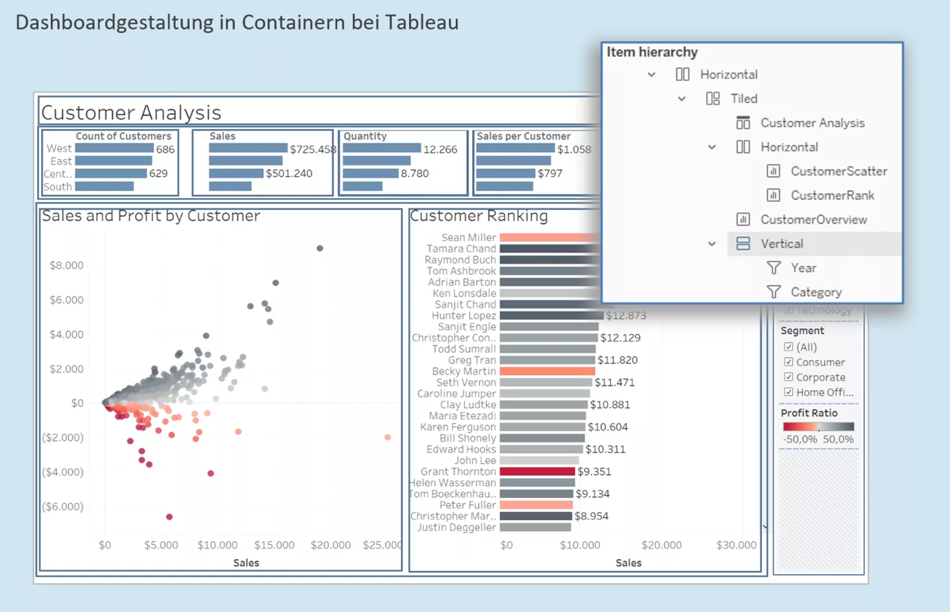
Tableau and Power BI differ not only in terms of visuals, but also creation of report pages. Power BI gives developers a lot of creative space by providing a white report canvas allowing free arrangement of all elements. The logic here is reminiscent of Power Point. In principle, this is also possible in Tableau. By default, however, arrangements are established in containers. This means that the entire reporting area is divided into containers whose size and position can be changed. These containers accommodate all elements (visuals, filters, logos, buttons, headers/footers, etc.). To create an empty area, for example, you insert a corresponding empty form into a container.
Of course, the outcome depends primarily on the developer's skills. However, I think it tends to make reports in Tableau look slightly tidier. Another advantage of this container strategy is the ability to simultaneously format all elements of a report page. In combination with automatic colour assignment, this greatly promotes a homogeneous appearance.
During development, I also discovered small, pleasant surprises which Tableau has in store. If you assign certain colours to a data value (for example, product categories), Tableau remembers this assignment and automatically uses the same colours for the next visual with the product category dimension. Power BI has yet to offer this feature to developers.
Measures are created similarly with both tools. An advantage of Tableau is that measures can be calculated at row level, and are therefore easier to write, especially for beginners. I had no opportunity to gain experience with complex measures in Tableau.
To sort a column's values, a sorting column is needed in Power BI. This problem is solved more easily in Tableau: Via drag & drop.
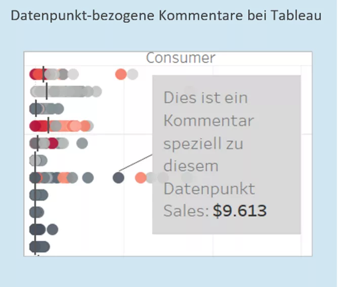
Another cool feature is the ability to add comments to individual data points. This can be a useful option for presentations.
In conclusion, I would like to say that the differences between both tools are relatively minor. Developers using one tool can quickly acquaint themselves with the other. Power BI arguably has the edge in terms of ETL and ease of use. Tableau, on the other hand, offers very good options for designing visuals.
Power BI, Tableau or a completely different visualization tool? Are you also currently on the lookout? Maybe we can help you!