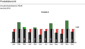
In presentations and in reporting, the primary purpose of graphics is to convey information quickly and efficiently. That means that graphics are supposed to illustrate important messages, such as e.g. trends, deviations, patterns and conspicuous behavior such as peaks, outliers etc. at a glance. This applies in particular if the objective is to use the Hichert©SUCCESS Rules in presentations and in reporting.
Arcplan Enterprise is an excellent tool for developing in a few steps graphics which may clearly convey such messages, as is illustrated below by means of a deviation analysis for products:
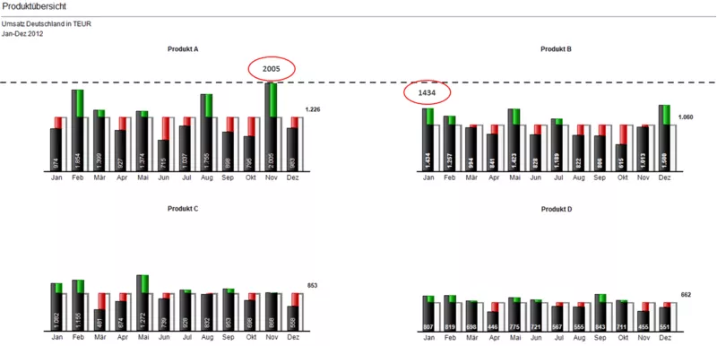
If a number of (identical) data - in this case products - is presented and compared to each other, it is important that the individual graphics are scaled uniformly so that the length of the bar is correctly proportioned to the values of all graphics.
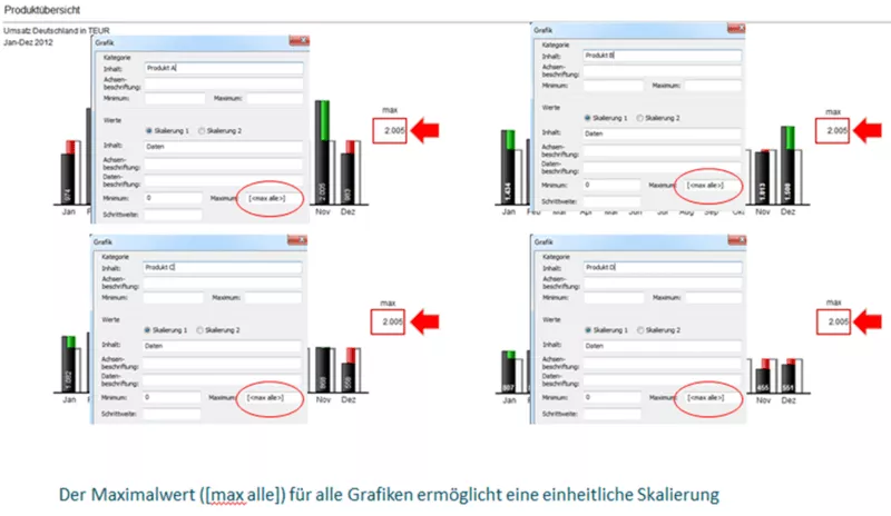
That means that all graphics - in this case product A to D - must have the same maximum value so that the lengths of the bars are correctly proportioned to each other.
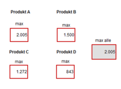
This can be achieved by calculating the overall maximum value from the maximum values of the individual products and by providing this overall maximum value for all graphics in a central object as "max all".
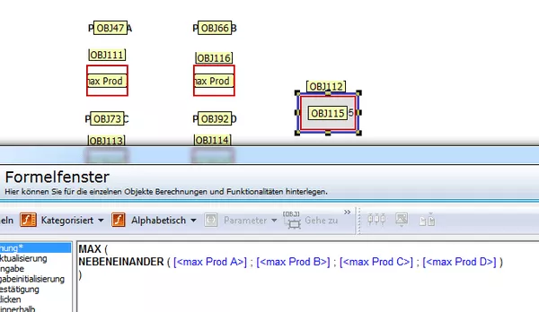
On the right, the individual maximum values, on the left, the formula for determining the value "max all":
In the arcplan formula window, this looks as follows:
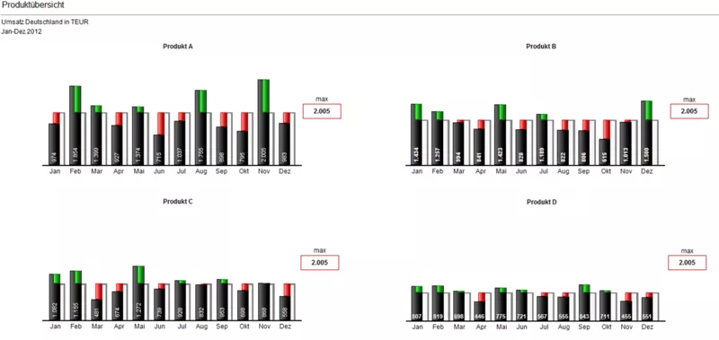
Finally, the overall maximum value "max all" is applied to each graphic.
Information from multiple graphics can be presented uniformly, correctly and comparably by applying this process. Uniform scaling is a material prerequisite for an efficient and correct interpretation of graphics and a tool for implementing the Hichert©SUCCESS Rules in dynamic reports. Note: the uniform scaling of graphics is only one element of reporting pursuant to Hichert©SUCCESS. Additional information from our Hichert-certified consultants (HCC) can be found here: Increasing Reporting Efficiency


