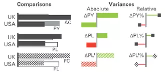
Time and again, one comes across types or variants of graphics which at first glance apparently cannot be implemented with arcplan. With simple tricks, however, almost all graphics can ultimately be realized with little effort. Anyone who is currently looking into SUCCESS by Hichert and Partners will encounter e.g. clear notations for value types in bar charts

(Source: Poster “SUCCESS Rules” by Hichert and Partners)
While the color and pattern of the bars can very easily be set in the arcplan format window for graphics, there is not setting for outline bars as proposed e.g. in the notation for the plan bar within the SUCCESS concept by Hichert and Partners (see illustration above).

With arcplan, the effect of outline bars can be achieved in two ways:
Alternative
Firstly, we generate a very simple graphic with black bars.

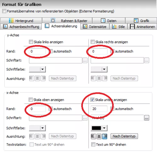
Important: with the exception of the bottom, all margins are set at “0” in order to obtain a fixed graphic size and positioning of the bars.

(Please note: of course, the bar sizes remain dynamic and change 100% flexibly according to the values)
Next, we duplicate the graphic:

The next three necessary settings are
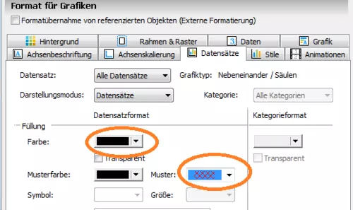
- bar color “white”
- transparent background and
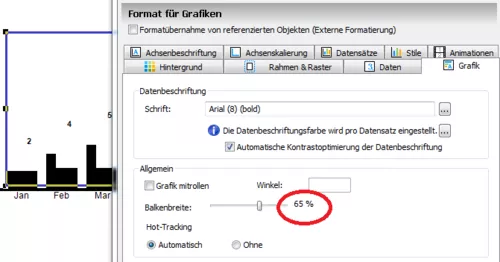
- reduction of bar width to e.g. 65%

Now, the second graphic only has to be moved slightly towards the bottom and dragged over the first graphic so that the black bars are almost fully covered by the white bars. The area of the black bars which is still visible now looks like a frame of the white bars and optically, we have outline bars. Finally, for the sake of a clear presentation, the scale at the bottom and the data labels are removed from the “upper” graphic (both are represented solely by the lower graphic).

Appendix:
If semantic axes are used, the “zero line” is now also adjusted accordingly. Here, the axis is a “single field” – at first black .

And with white color and black frame (see below), the axis correlates to the bars.

Alternative 2 will be presented in the next b.telligent “arcplan” Blog


